Lowlytics - An AI-powered low code SAAS Platform
Lowlytics is a low-code platform that enables users to build, monitor, and optimise AI-powered applications without writing complex code. The platform helps non-technical users create and manage apps efficiently while providing insights to improve performance. My work focused on designing intuitive flows, validating interactions through usability testing, and ensuring a seamless handoff to developers for implementation.
.jpg)
My Role
The Team
2 Founders
Project Manager
Backend Developer
AI/ML Engineer
QA Tester
Senior UX Designer
UX Designer (Me)
-
User Interviews- Conducted to understand needs and validate concepts
-
User Flows- Defined key interactions and end-to-end experience
-
Information Architecture- Mapped navigation for clarity and scalability
-
UI Design- Designed Monitoring Dashboard with clear data visualisation
-
User Testing- Ran sessions to uncover friction and refine workflows
Low-code tools have made app creation easier, but the workflow is still fragmented. Non-technical teams often switch between multiple tools to design, build and improve their apps, with limited AI support. This makes it difficult to move quickly and keep improving once an app is live.
Competitive Analysis
We observed that existing low-code tools either provide strong guidance or a continuous workflow, but rarely both. Bubble offers creative flexibility but overwhelms new users, Adalo and Glide simplify onboarding but limit customization, and Retool supports end-to-end workflows but assumes technical expertise. This gap represents both a UX challenge and a market opportunity, which Lowlytics aims to address by combining clear guidance with a seamless build-to-monitor experience.

Product Direction
-
Freedom without overwhelm — helping users start confidently without restricting creativity.
-
One connected flow — build, monitor, and improve seamlessly without switching tools.
-
Trustworthy AI — explaining decisions and keeping users in control.
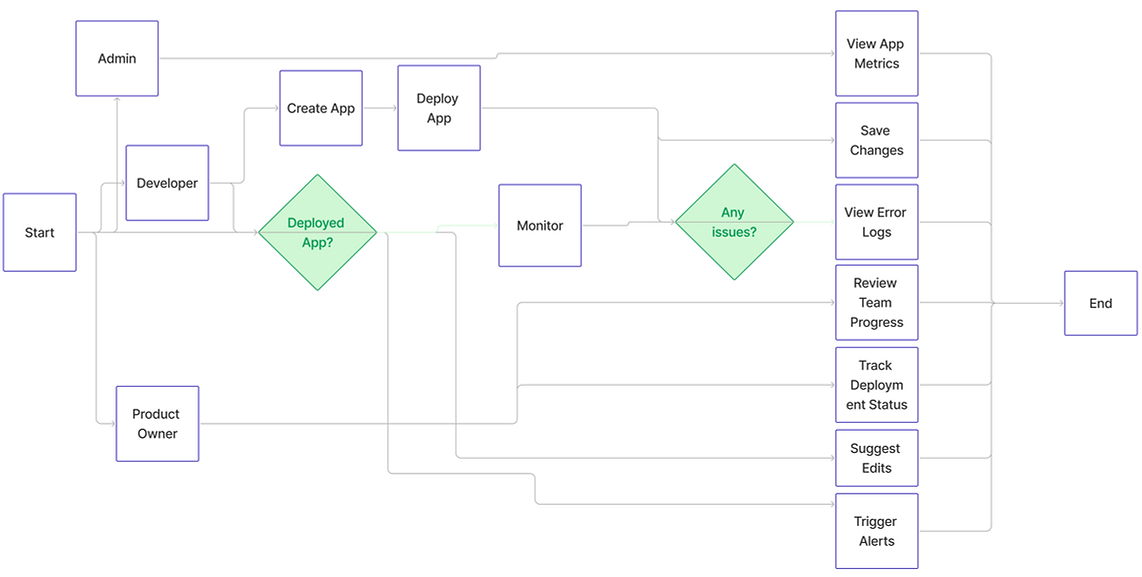
Crafting the user flow
I mapped the end-to-end user journey, covering app creation, deployment, monitoring and issue resolution. The flow clearly defines touchpoints for each role, including admin, developer and product owner, and establishes a continuous loop that allows teams to build, track and improve apps without breaking the workflow.
.png)
Information Architecture
The initial information architecture was a collaborative effort between the senior designer, the product manager and myself. The senior designer set the overall structure based on the product vision, while I ensured it reflected insights from user research. For example, I grouped monitoring and AI insights into a single logical area so it made sense to users, rather than feeling like two separate features. My focus was on making the hierarchy match how users think about their tasks, not just how the system was built.

Iterations
During this stage, I explored how to categorise errors, warnings, and deployment, as well as the feasibility of surfacing AI recommendations within the app. To build user trust, I proposed showing confidence levels for AI suggestions. This approach maintained transparency for users while protecting the product’s perception.
.png)

.jpg)
Iteration 01
Iteration 02
Iteration 03
.jpg)
Final Design
Testing
We tested the login flow with 32 participants, including developers, non-technical users, and startup founders, using Maze. The results showed the flow was largely intuitive, usable, and efficient. I prepared the Figma files for developer handoff, documented interactions, and walked through them with the engineering team to ensure accurate implementation.
83%
Task Success Rate
0.9
Misclicks per session
70
SUS Score
13m30s
Average time to completion
Impact
With the MVP now live, Lowlytics enables users to build, launch, and monitor AI-powered apps with minimal coding. Early testing and monitoring features have validated the workflow, built trust in AI recommendations, and provided actionable insights for users. Work is ongoing to refine the experience, improve adoption, and expand features, ensuring the platform continues to deliver long-term value for businesses.